
Conveying complex information with clarityisons

Project
Security Enterprise Resilience
Client
Buro Happold
Creative Fields
Data Visualisation, Infographic
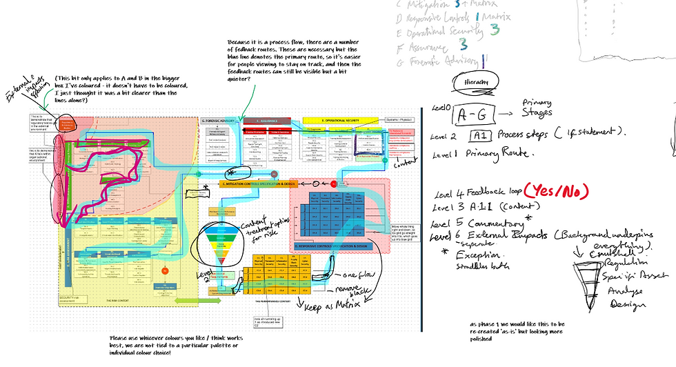
This project was for the security team to help develop a flow diagram in a clear format that distinguished the different stages of their assessments. The challenge was the intricate level of metrices within the user flow.
With the need of a clear journey, in a start-to-finish cycle, this infographic was developed to concisely demonstrate the different stages and various actions implemented within them. It also applied other metrices, such as the different context and achievement reviews between stages to ensure assessment has been thoroughly achieved.
This example shows the depth required in understanding the information to convey the security team’s message in the best way possible. Click to see the different project stages in developing the final infographic.


_edited.png)